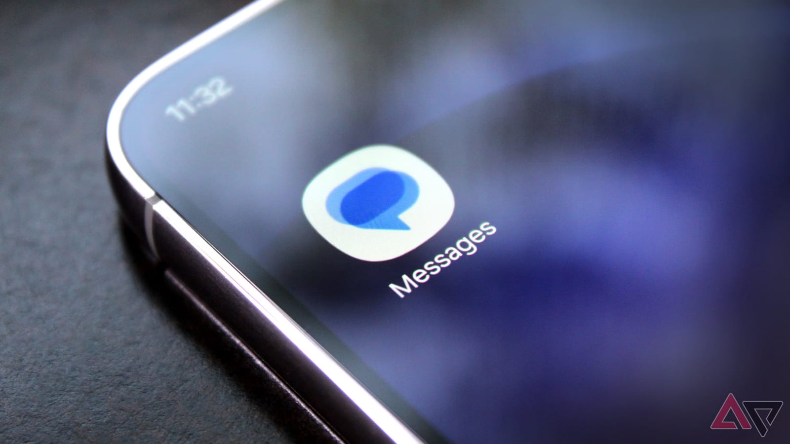
Google has started rolling out new icons for three of its main Android apps: Messages, Phone and Contacts. If your home screen looks a little different soon, that is the reason. Only the pictures are changing. The apps themselves work the same way.
What changed
The new icons use softer blends of color, known as gradients. Google says the edges are more defined, the curves are slightly adjusted and the colors are tweaked. The goal is a sharper, clearer look on the home screen and in the app drawer, the screen that lists all your apps. The icons do not look dramatically different from the old ones.
This is part of a wider pattern. Last year, Google gave its "G" logo a gradient look, which the company said reflected a shift toward an AI-first era. Earlier this year, a similar design reached nearly all of its Workspace apps, including Gmail, Drive, Docs and Calendar. The aim is to make Google's apps feel consistent.
What to expect
Google says the rollout has already begun and the icons should appear on Android phones over the coming days. The reporter at Android Police had not yet spotted them on his Pixel 11 Pro, so your phone may get them a little later.
Messages, Phone and Contacts keep the same features. There is nothing to update by hand and nothing to fix. The material does not say exactly when each phone will get the change, or whether more Google apps are next.
The takeawayNew Messages, Phone and Contacts icons are on the way to Android phones, and they are a cosmetic change only.